Dark Dining Dynasty

Black is the new black? Yes, it is! Black is coming in hot in the hospitality industry with more restaurants incorporating dark interior design and fit-outs. Although some restaurants take dark dining quite literally by making guests eat blindfolded, we much prefer the allure of dark-themed dining rooms. As colour is an important element that impacts how we feel, let’s talk about how it affects the dining space and a restaurant’s patrons.
To get into the nitty-gritty of colour psychology, according to Orbelo, we often associate black with mystery, elegance and sophistication; all of which can be applied to fine dining. To get an insider’s take on dark colour palettes and how they affect the restaurant setting, we need to sit down with an interior pro. So, we’ll be talking to Simon Boyce of the interior group, Collectivus.

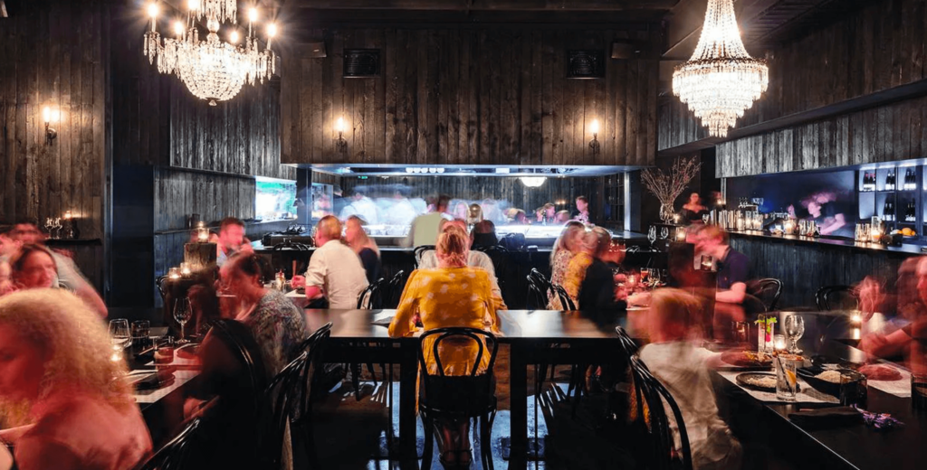
INSPIRED BY | Honto, QLD
Q: What is your take on how a dark atmosphere affects a patrons dining experience?
A: Typically, darkened dining spaces are used in fine dining restaurants to create an atmosphere of sophistication and romance. The dining experience feels more premium and intimate, but only if the rest of the fit-out is of a similar level (in terms of materiality and build quality). In other hospitality segments (i.e. fast food), darkened spaces are more aligned with poorly designed lighting layouts.
Q: Do you think this colour trend is going to have a long lifespan? Or burn out fast?
A: In the fine-dining segment, there will always be a place for darkened dining areas. In other hospitality, segments darkened spaces could be a designers response to all the light and bright Scandi design that’s so prominent in interiors currently, in which case could follow a trend cycle.
Q: Since we went to the darkest end of the spectrum, do you think we will ever get to the point where pure white restaurants will be the “it thing”?
A: I don’t think pure white will ever be a thing as white needs other elements and colours to soften it and create focus. Additionally, an all-white interior is almost impossible to maintain – something which designers would point out to any prospective client wishing to head down that route.
Q: Finally, how can restaurants with a dark colour palette stand out from their competitors with their design choices?
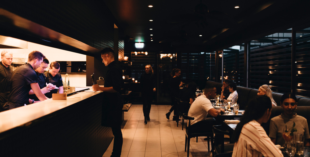
A: The overarching design theme needs to make sense with a darkened lighting scheme. A beachside breakfast and lunch venue that specialises in seafood would be better with a light and bright palette. A chef wanting to create a sophisticated European restaurant to replicate an 1800’s Tuscan villa or a New York prohibition Speakeasy could create the right atmosphere with a darker interior. There also needs to be a focus on beautiful details in joinery, using lighting to draw the eye to specific design features, pin-spot lighting on tables, using premium authentic materials and creating buffers so the kitchen and food prep areas (which require brighter lighting) are not in direct line of sight.

INSPIRED BY | Rogue Bistro, QLD
After sitting down with Simon, it’s clear that colour psychology plays a massive role in how a restaurant conveys itself to guests. Although dark dining rooms are on the rise, restaurant owners must carefully consider if their interior design and fit-out align with their contextual circumstances (e.g. target demographic and geographical location). With signs that dark dining has cemented its place in the hospitality industry as a staple for fine dining, we’re looking forward to seeing how this theme will be elevated in the coming years.
Want to make your restaurant stand out from the competition? Get in touch with us today.


